English
Works /
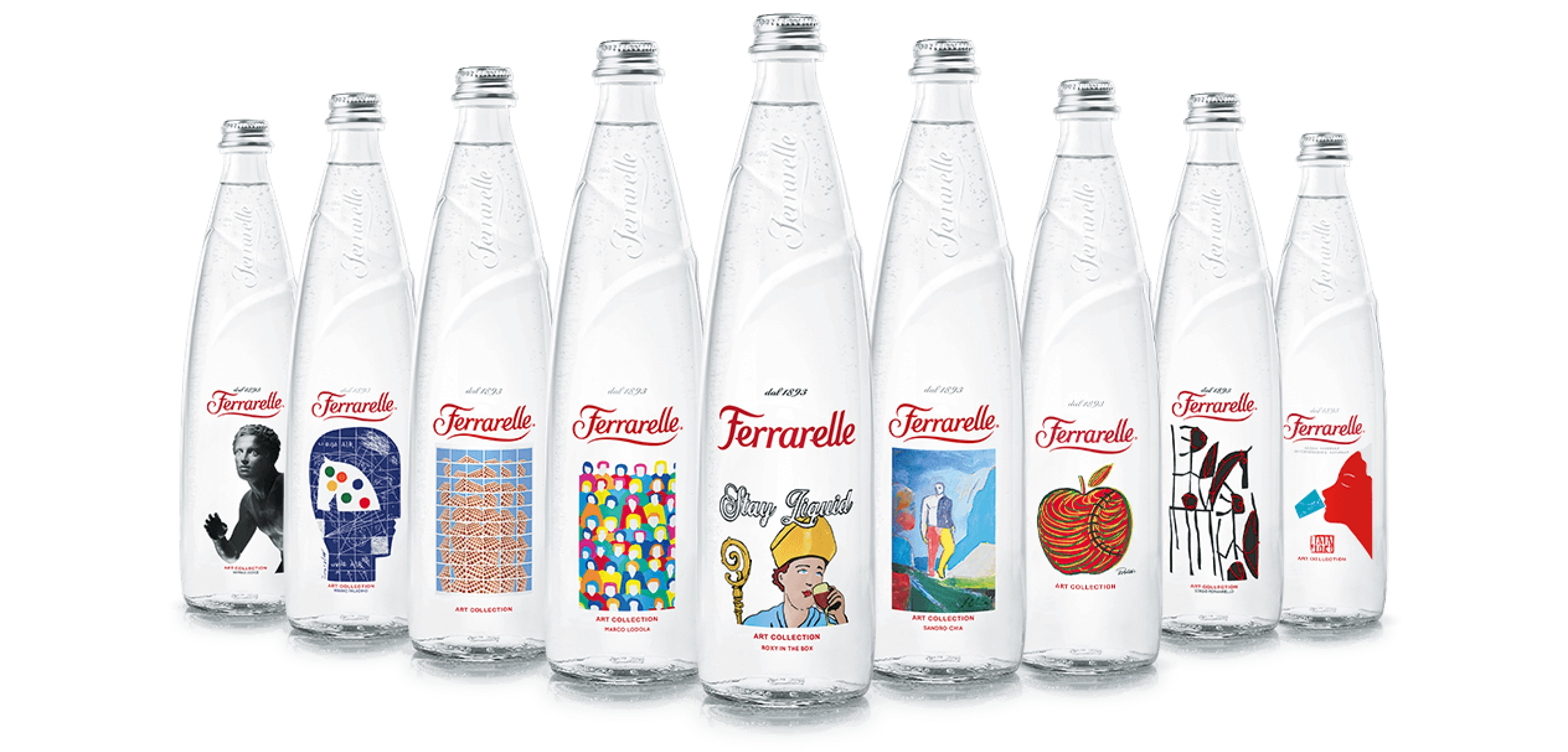
Ferrarelle
Iconic water. Design opens up new business scenarios.

Insight
The Super Ho.Re.Ca market
Born from the need to affirm a well-known brand like Ferrarelle in the context of ‘water bottle design’, the project is able to engage with the high-end food and international catering and hospitality market.
The starting point was to ‘make the Ferrarelle brand physical’. The bottle itself becomes a recognisable brand.
The Platinum Edition bottle is distinguished by the rippling of the glass and the lightly embossed vertical branding that proudly showcases an Italian icon of inimitable effervescence.
Studio
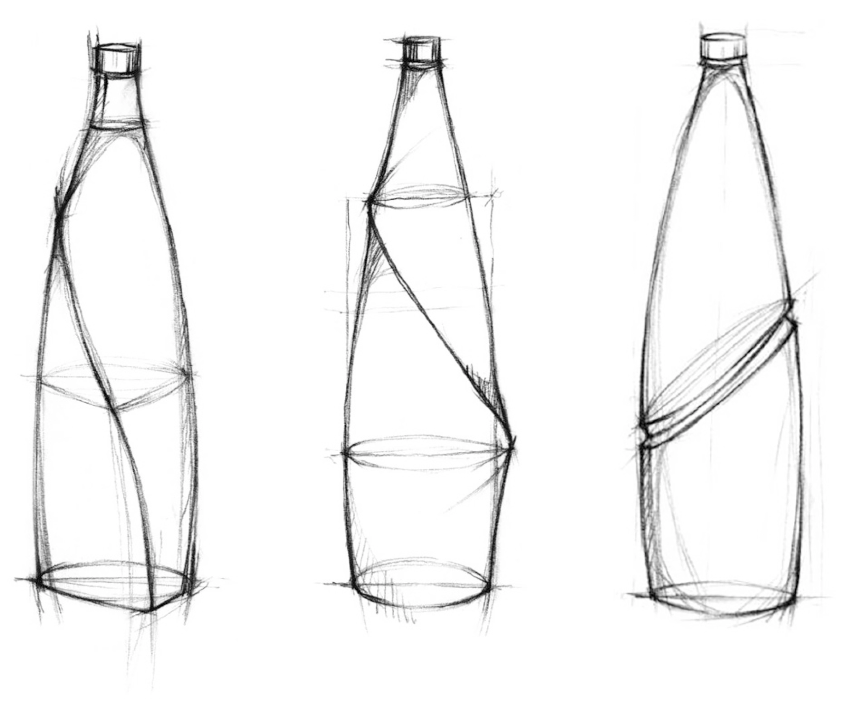
The Design Genesis.
The bottle appears as a completely transparent volume, designed in compliance with the constraints of the company’s bottling plant, whose harmony is emphasised by the choice of a precious serigraphic label, which does not interfere with the transparency. The choice of a very clear glass, the absence of edges, the wave that levitates offering greater stability in the grip, are the strong elements of a project that focuses on the purity of the lines and the tactility of the shapes.