English
Works /
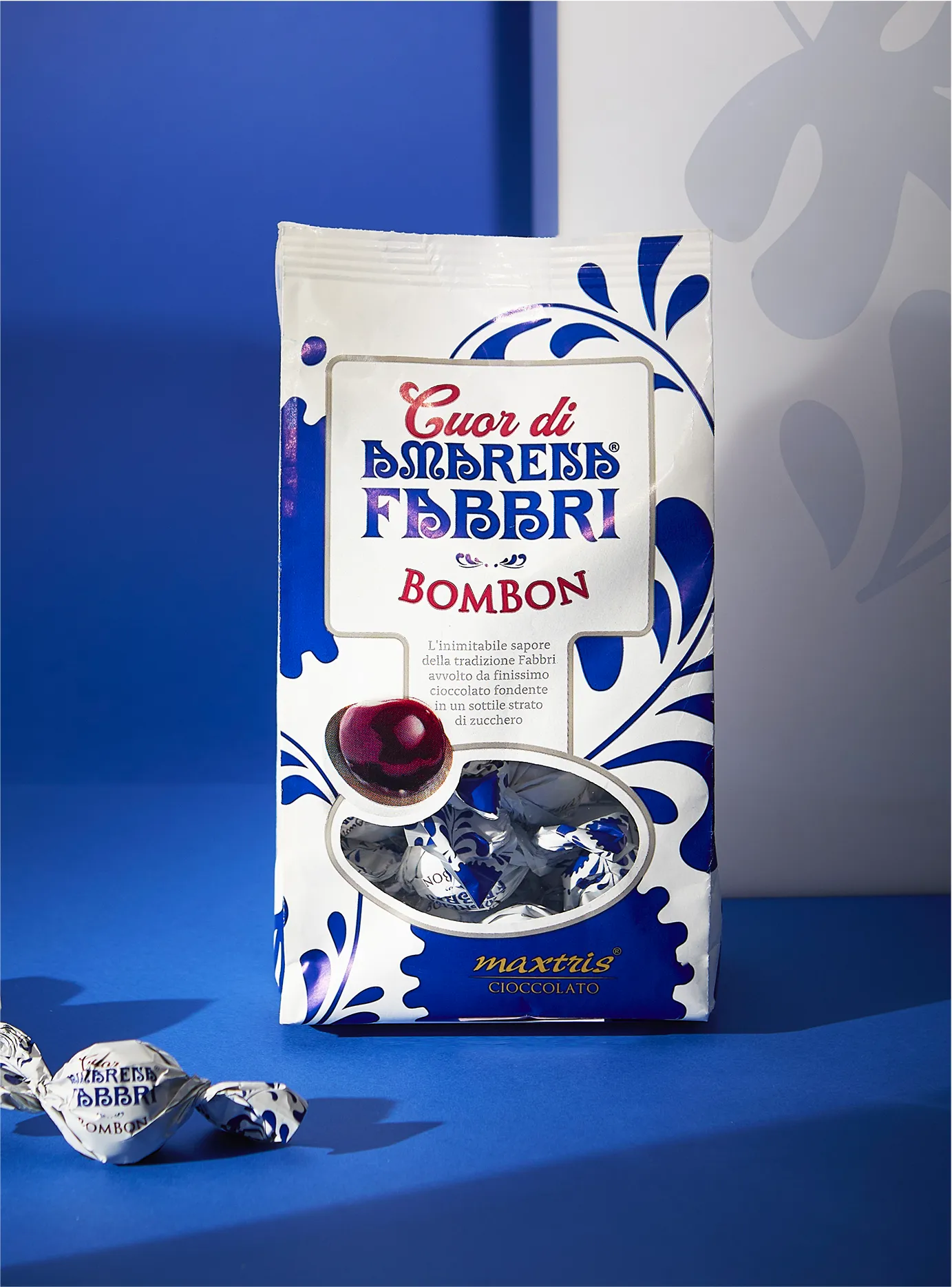
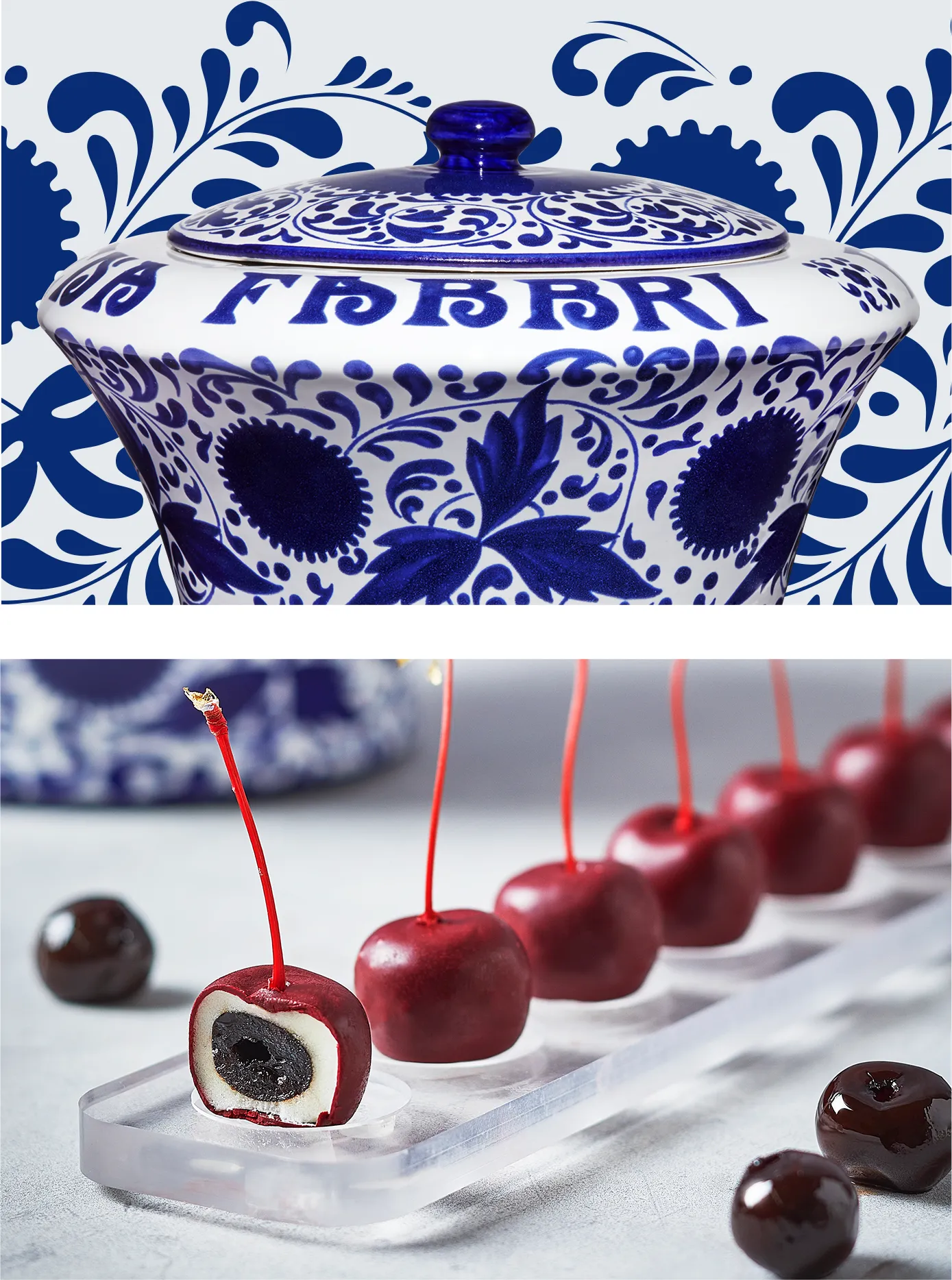
Fabbri
From tradition to modernity
Identity
A family history since 1905 for the company that reinvented the 'Amarena' sour cherry more than 100 years ago and has not stopped growing ever since.
Reinterpreting tradition with ever-new products while maintaining the genuine goodness of all time: this is what Fabbri pursues and communicates also through its attractive packaging, the result of many years of collaboration with the agency.
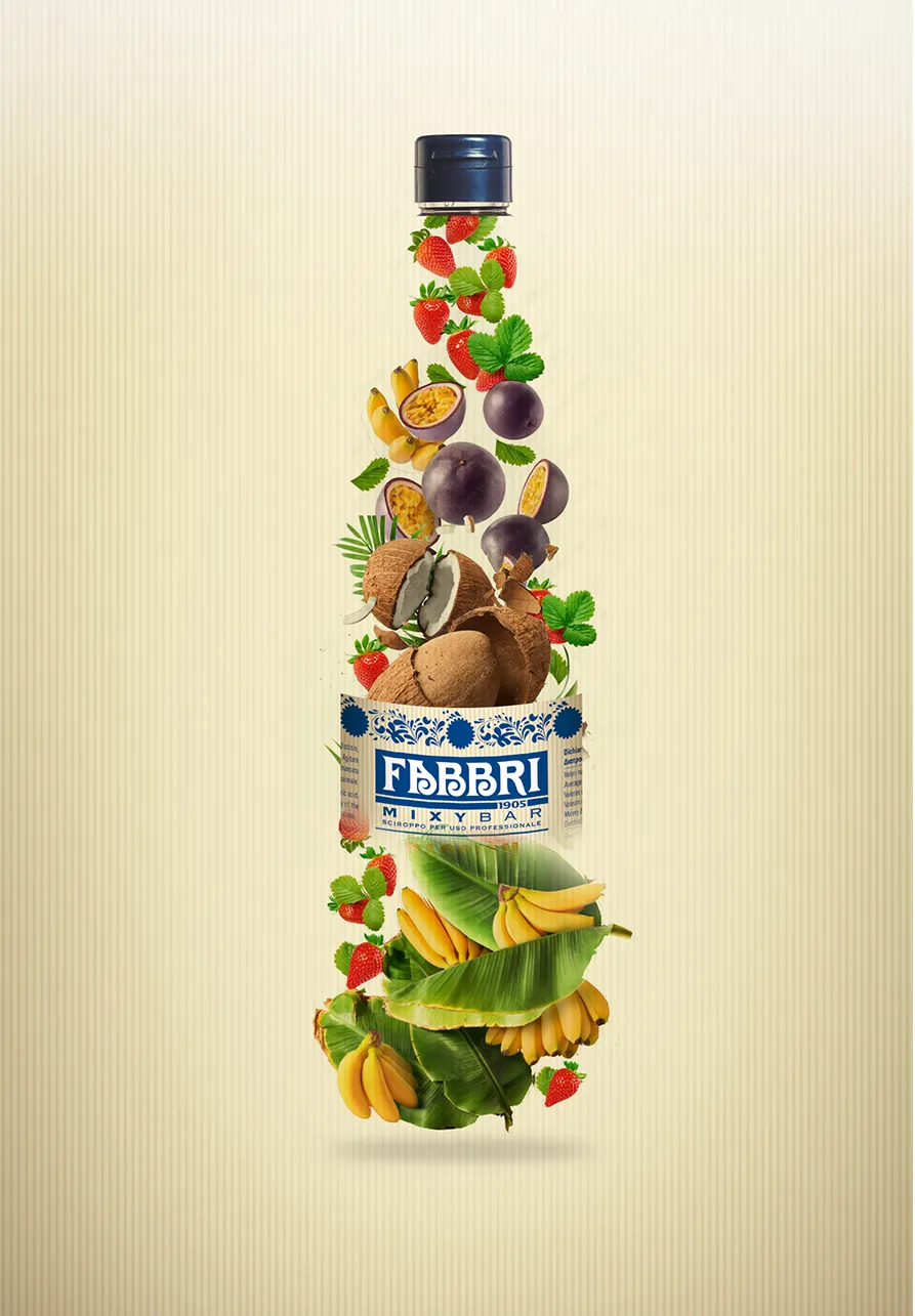
New icons
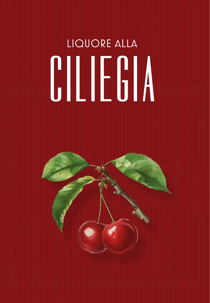
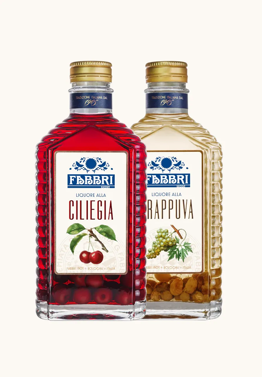
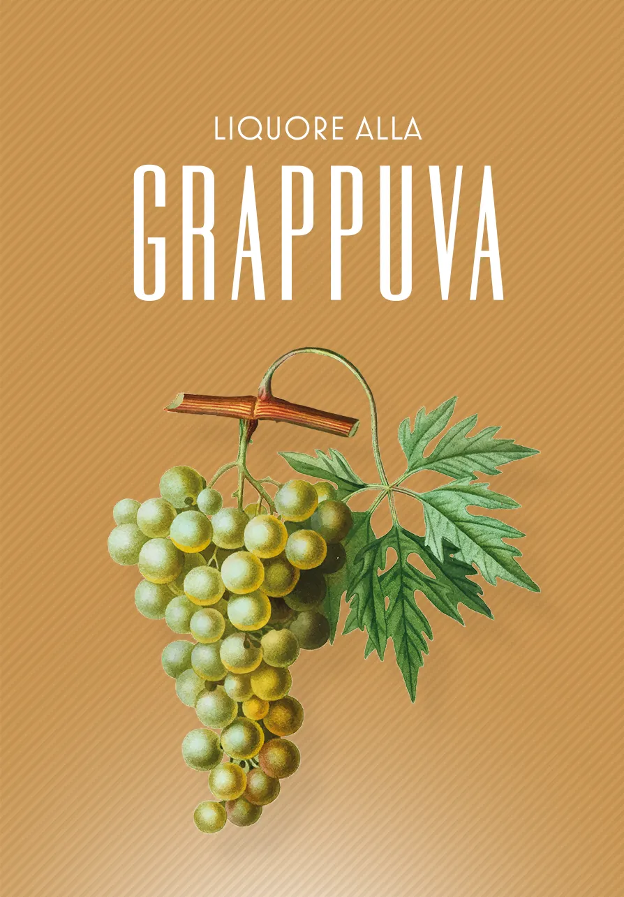
From ginger pearls to cherry bombons, from syrups to fruit liqueurs, the world of Fabbri is always new and yet always familiar.
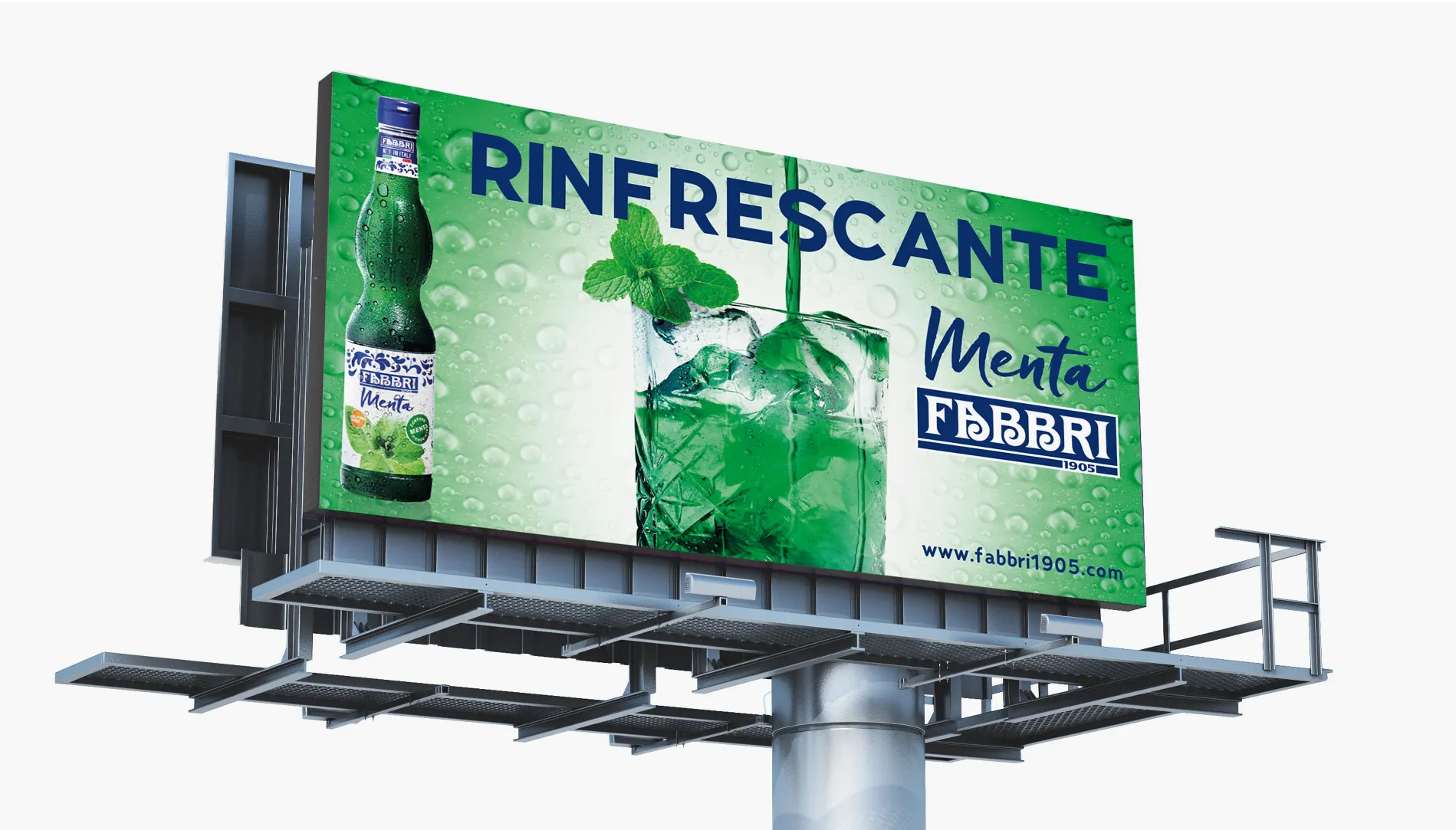
Through a visual language that translates the stylistic features of tradition in a contemporary key, winking at a decidedly vintage elegance, the communication focuses on the product and the genuine ingredients that are the company's trademark.
In a blaze of fruit and botanical elements, the logo always stands out strongly, its lettering clearly recognisable and unchanged for decades, a guarantee of quality, research and sustainability. All product ranges, despite their variety, convey these same values in an unbroken line of continuity from the first generation to today.
The communication concept applied to the various projects always starts from a rigorous philosophy of respect for the formal canons inherited from tradition, with a view to maximum brand loyalty and recognisability.
Graphics, texts, iconographic styles, everything speaks of a world that recovers the authenticity of an ancient flavour for consumption in line with the style of the times, as in the case of the more versatile and fashionable lines dedicated to the world of mixology.
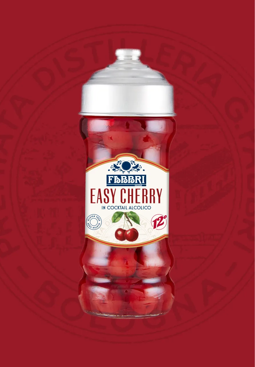
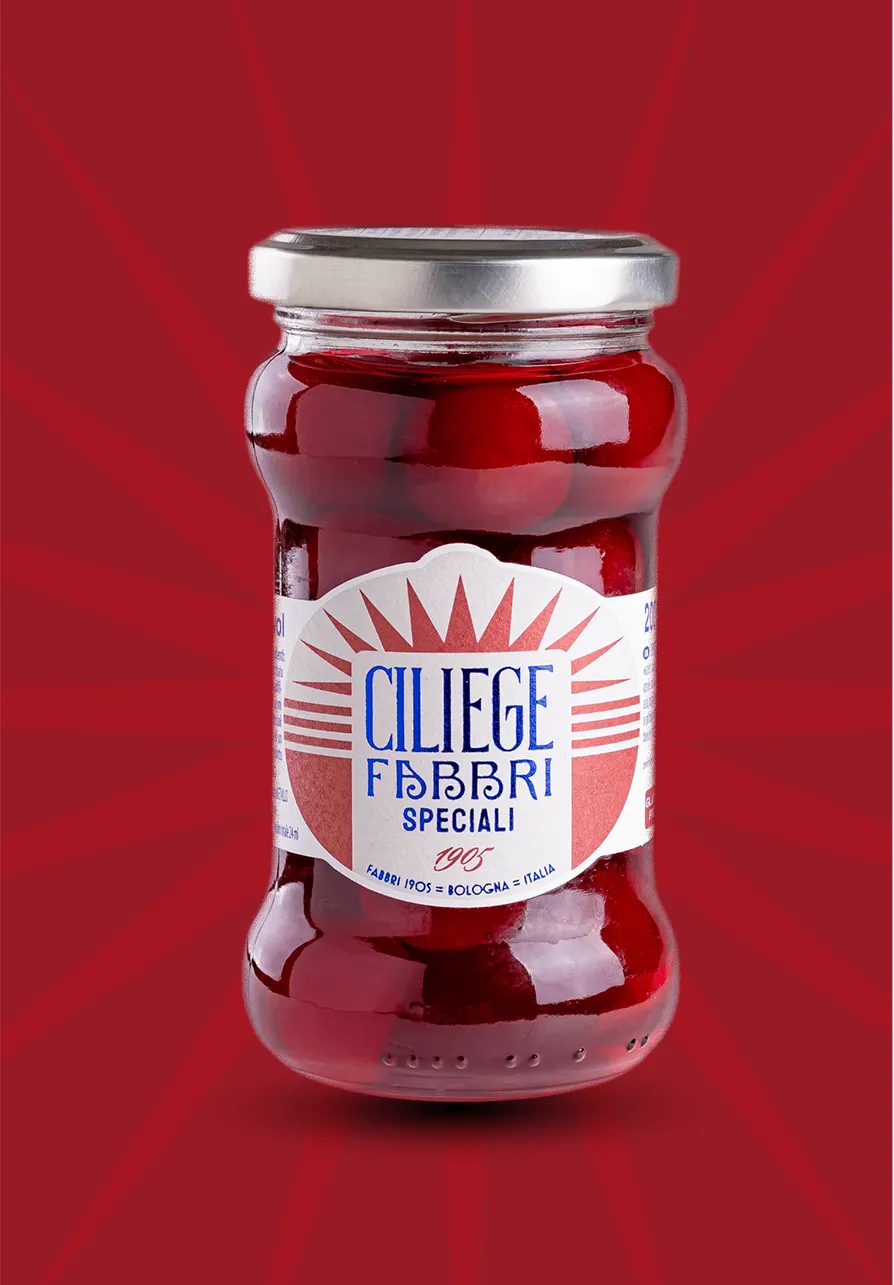
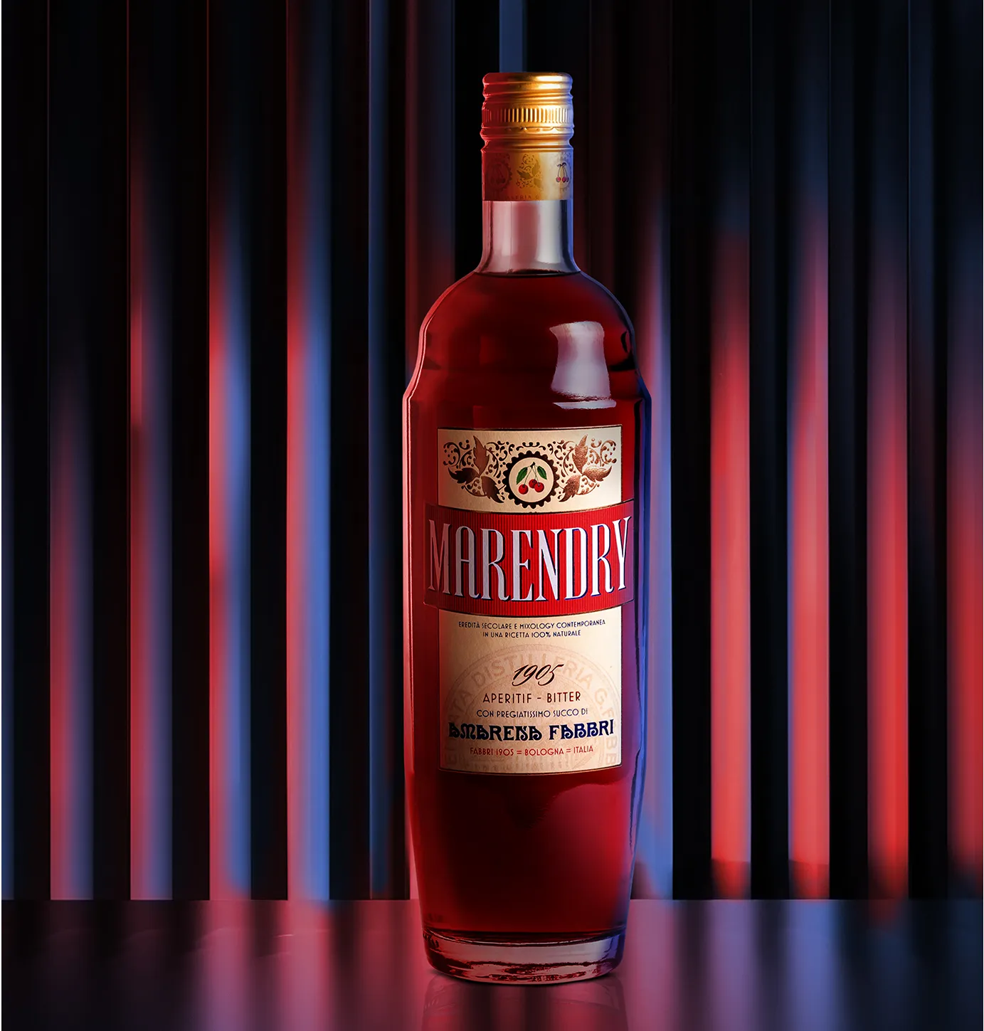
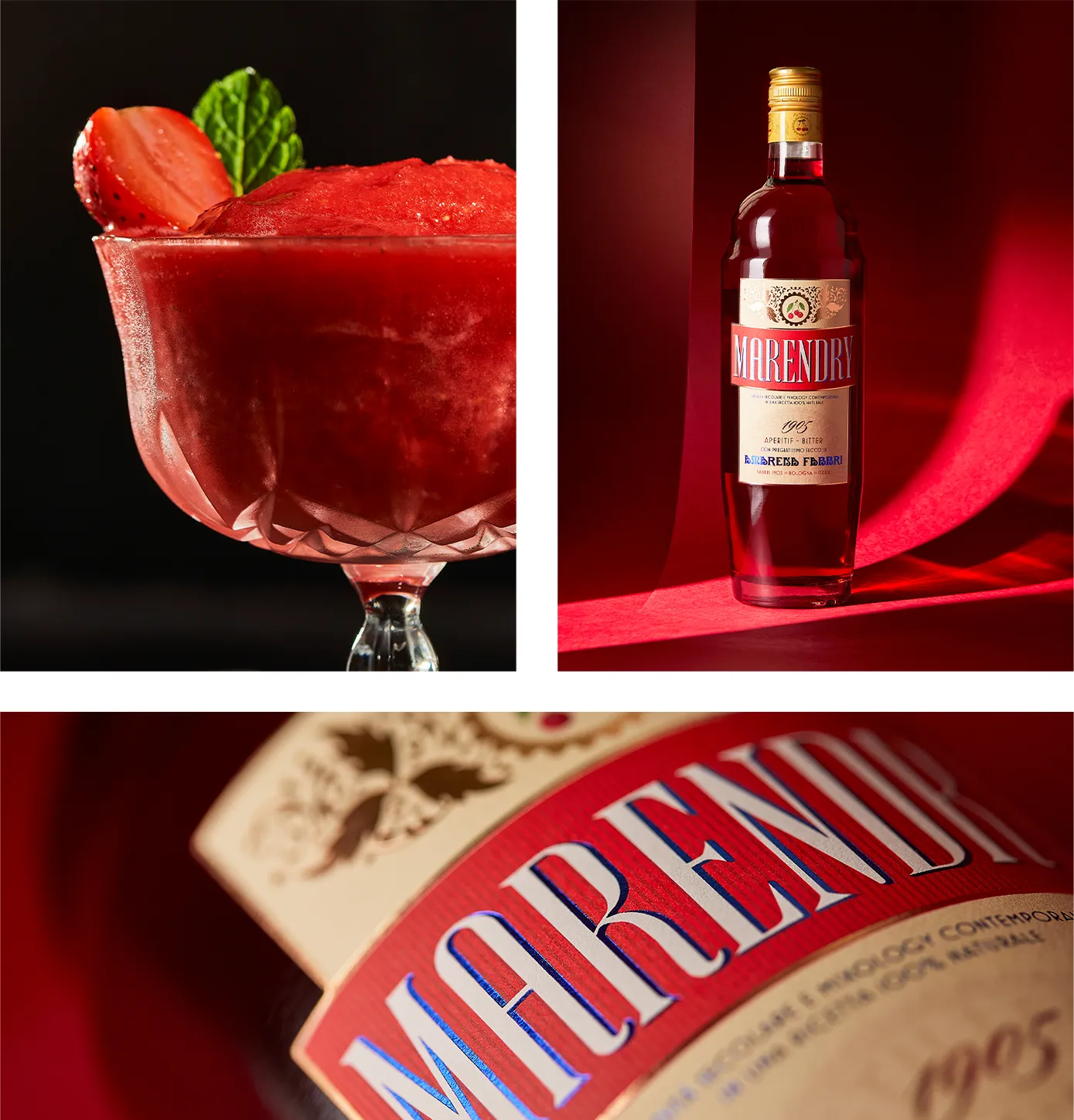
Particular attention has also been paid to the liqueur range, which has been created from scratch, and to the fruit liqueur range, which has been entirely revisited.